HI*PRA Values
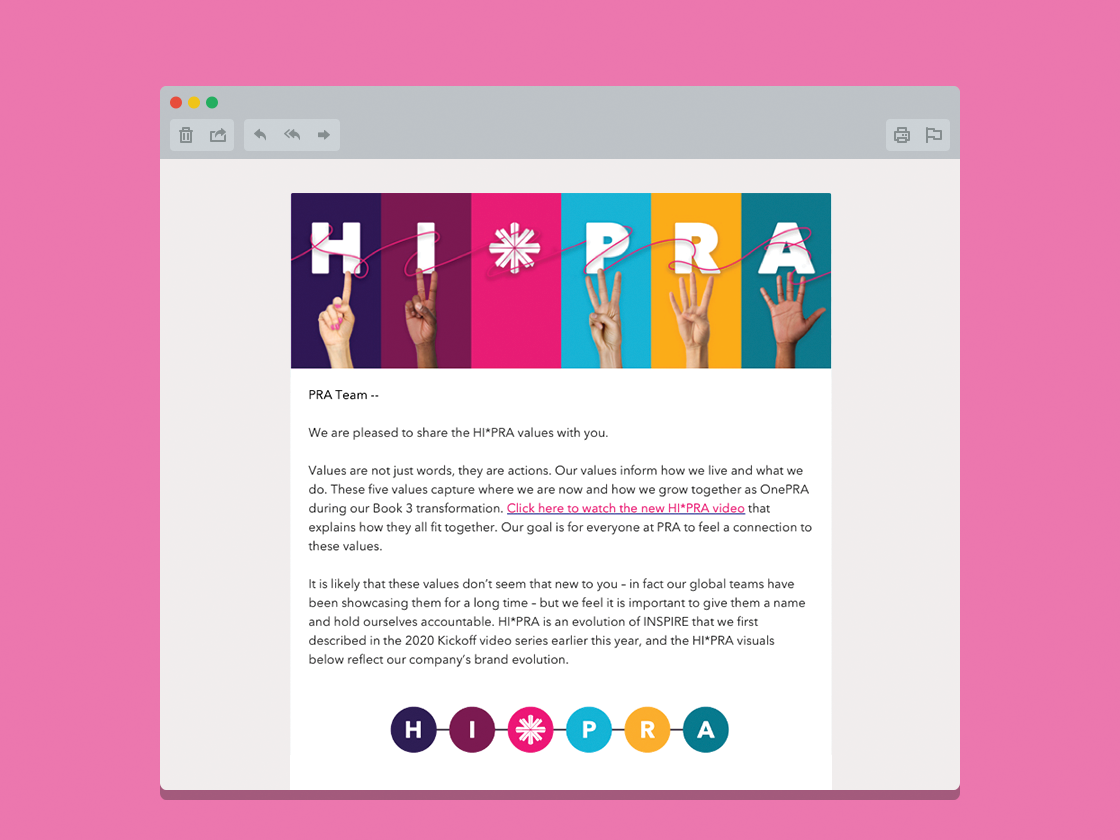
HI*PRA is a visual identity and campaign created to define our core values in a way that spoke to both our diversity and human-centricity. PRA achieved this by applying an expanded version of our color palette in bold ways to create a cohesive but varied and eye-catching concept. The visual paradigm was extended to cascading information, applying a specific color identifier to each of the values in supporting materials. A loose line of PRA pink is applied to the layout, visualizing how each of these colors/values are connected by a shared, personal touch. The additional design element of visually diverse hands further emphasizes the idea of personal touch.


